
# 话不多说直接教程
在 CSS 中,也就是借助 background + backdrop-filter: blur() 即可实现。
# 效果
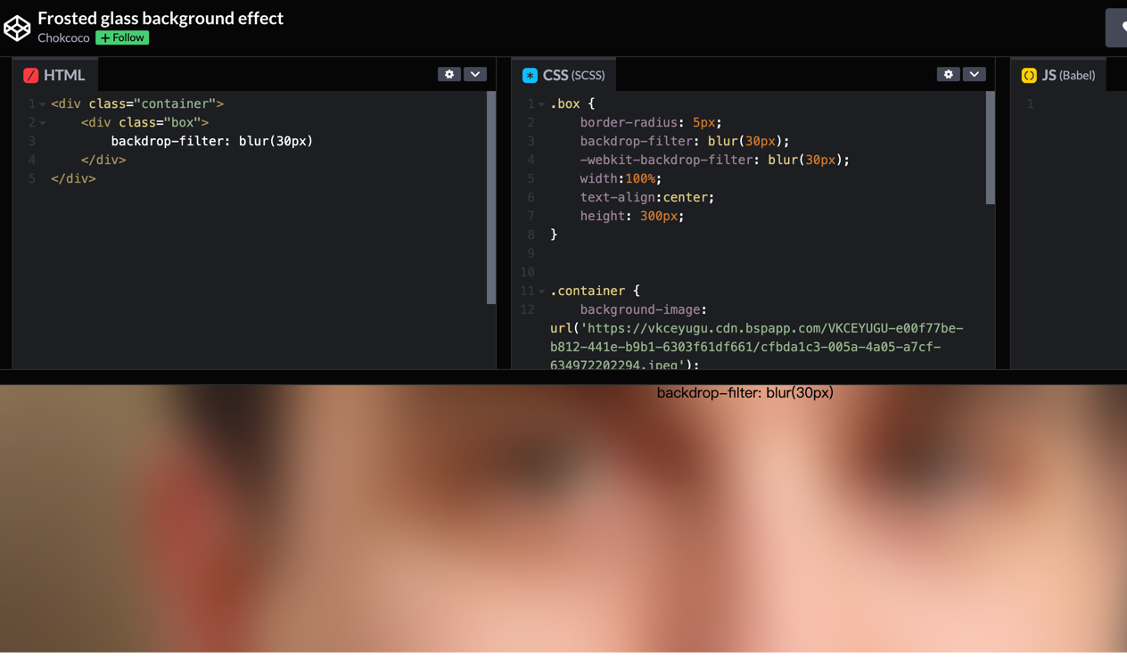
# 使用 backdrop-filter 实现高斯模糊蒙版 这里简单列下代码
<div class="container">
    <div class="box">
        backdrop-filter: blur(10px)
    </div>
</div>
1
2
3
4
5
2
3
4
5
.box {
    border-radius: 5px;
    backdrop-filter: blur(10px);
    -webkit-backdrop-filter: blur(10px);
    width:100%;
    text-align:center;
    height: 300px;
}


.container {
    background-image: url('https://vkceyugu.cdn.bspapp.com/VKCEYUGU-e00f77be-b812-441e-b9b1-6303f61df661/cfbda1c3-005a-4a05-a7cf-634972202294.jpeg');
    background-position: center center;
    background-repeat: no-repeat;
    background-size: cover;
    align-items: center;
    display: flex;
    justify-content: center;
    height: 300px;
    width: 100%;
}
1
2
3
4
5
6
7
8
9
10
11
12
13
14
15
16
17
18
19
20
21
2
3
4
5
6
7
8
9
10
11
12
13
14
15
16
17
18
19
20
21